Help Desk
Dashboards
Due to the nature of the cube dimension, floor positions may contain text in some venues. As a result, such columns are sorted as text.
Click on the column header to sort a table column.
Export to PDF and Print buttons are exporting dashboard as seen on the screen. To export the entire table, use Export to Excel.
Please see How do I export to Excel? for more details.
Only selected tables can be exported to Excel.
To export to Excel, click on the icon located on the top right corner of the panel containing the required table.
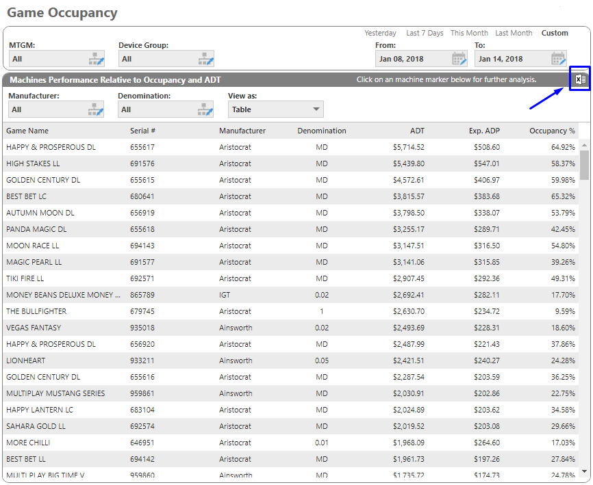
If you need to export a table that does not have this functionality, please phone 1300 060 026 or email support@ebetsystems.com.au.
Click on the link  in
the top right corner.
Click on the link  in the top right corner.
Note: Print functionality is not supported in Mozilla Firefox at the moment.
Astute dashboards recognise touchscreen devices and enable Touch Events in browsers by default.
With Touch Events enabled, checkboxes may work reversed in some browsers. To address this, we recommend to disable Touch Events in your browser. Please see How to disable/enable touch events for Astute website for more details.
The following browsers are supported by Astute BI:
- Google Chrome 63+
- Mozilla Firefox 57+
- Internet Explorer 11+
- Microsoft Edge 16+
- Safari 11+
EGM occupancy is measured by the percentage of time that a machine is available (ie. a venue's operating hours) compared to the time that the EGM is played. The higher the percentage, the more popular a game is.
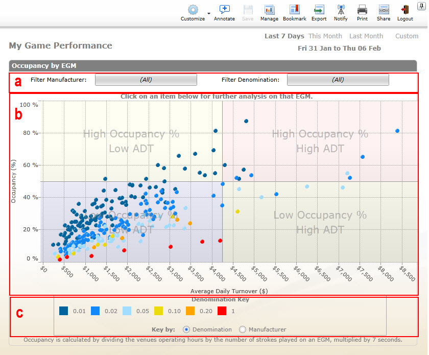
a. Filter Menu
b. Scatter Graph
The Astute BI EGM Occupancy Dashboard (above) displays occupancy and average daily turnover. Click on a dot and a pop up window will appear with details for that particular EGM.
Occupancy is calculated by dividing the venue's operating hours by the number of strokes played on an EGM, multiplied by 7 seconds.
EGMs falling in the red ‘hot section’ have the combination of high occupancy and average daily turnover.
On mobile devices, popups on floor maps are still can be accessible by pressing and holding on the machine until tooltip is show and then taping on the element again.
If you are using mouse or touchpad, then we recommend to disable Touch Events in your browser. Please see How to disable/enable touch events for Astute website for more details.
Astute dashboards recognise touchscreen devices and enable Touch Events in browsers by default.
With Touch Events enabled, popups on floor maps are still can be accessible by pressing and holding left mouse button on the required machine until tooltip is shown, and then clicking on the element again.
If you are not planning to use touchscreen and prefer mouse or touchpad, then we recommend to disable Touch Events in your browser. Please see How to disable/enable touch events for Astute website for more details.
On mobile devices, tooltips are still can be accessible by pressing and holding on the required label, table, or chart.
If you are using mouse or touchpad, then we recommend to disable Touch Events in your browser. Please see How to disable/enable touch events for Astute website for more details.
Astute dashboards recognise touchscreen devices and enable Touch Events in browsers by default.
Please be aware that tooltips on some dashboards may not be supported in all browsers.
With Touch Events enabled, tooltips are still can be accessible by pressing and holding left mouse button on the required label, table, or chart.
If you are not planning to use touchscreen and prefer mouse or touchpad, then we recommend to disable Touch Events in your browser. Please see How to disable/enable touch events for Astute website for more details.
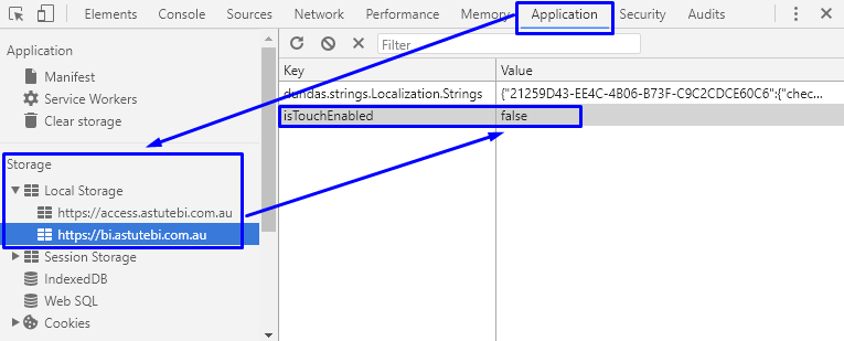
The setting to enable/disable touch screen events is stored in local storage in a browser memory and can be changed. Please refer to your browser instructions below to disable touch screen events.
Google Chrome:
- Open a page with any Astute BI dashboard.
- Press F12 button on your keyboard to open Chrome DevTools.
- Select Application tab on the top of Chrome DevTools panel.
- Expand Local Storage in the left pane and click on https:/bi.astutebi.com.au.
- Set the value of isTouchEnable key to false to disable or true to enable touch events.
- Close Chrome DevTools and refresh the page.
Mozilla Firefox:
- Open a page with any Astute BI dashboard.
- Press F12 button on your keyboard to open Firefox Developer Tools.
-
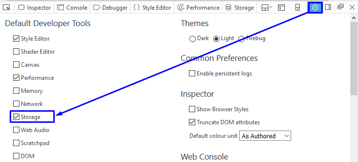
Select Storage tab on the top of
Firefox Developer Tools panel. If Storage tab
is not shown, then it can be added by clicking on the cog icon and selecting
from the list of Default Developer Tools.
- Expand Local Storage in the left pane and click on https:/bi.astutebi.com.au
- Set the value of isTouchEnable key to false to disable or true to enable touch events.
- Close Firefox Developer Tools and refresh the page.

Internet Explorer:
- Open a page with any Astute BI dashboard.
- Press F12 button on your keyboard to open IE Developer Tools.
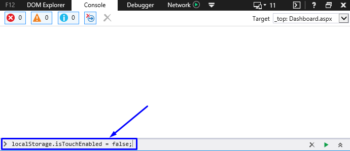
- Select Console tab on the top of IE Developer Tools panel.
- Type localStorage.isTouchEnabled = false to disable touch events or localStorage.isTouchEnabled = true to enable touch events in the input field and press Enter.
- Close IE Developer Tools and refresh the page.
Microsoft Edge:
- Open a page with any Astute BI dashboard.
- Press F12 button on your keyboard to open Edge Developer Tools.
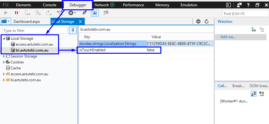
- Select Debugger tab on the top of Edge Developer Tools panel.
- Expand Local Storage in the left pane and click on bi.astutebi.com.au.
- Set the value of isTouchEnable key to false or true to enable touch events.
- Close Edge Developer Tools and refresh the page.
The Cube
One of the benefits of Astute BI is direct access to your own data cube. The data cube stores your data in a ready-to-use state, and this is accessible from anywhere with an internet connection and Microsoft Excel versions 2007 or 2010. This version will guide you through Excel 2010.
This guide steps through the process of connecting to your data cube.
- Open Microsoft Excel 2010
-
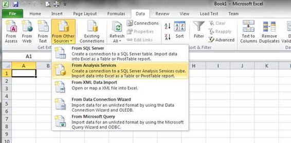
Click the
Data Tab -> From Other Sources -> From Analysis Services
-
Enter your connection details into the Connection screen below.
a. The server address is https://c.industrydataonline.com/olap/msmdpump.dll
b. Your username and password would have been provided to you at registration
c. The catalogue to use is Gaming
d. Click OK to save and continue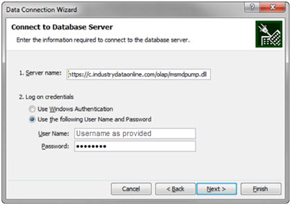
-
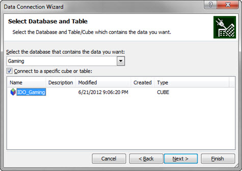
Next, ensure Gaming is selected for the database, and IDO_Gaming is selected
for the cube/table. Click
Next.
-
On the “Save Data Connection File” and Finish, ensure that “Save password
in file” is checked. Change the File Name, Description & Friendly Name
to something which is easily disguisable. This will assist you when selecting
this connection in the future. Click
Finish.
Click Yes to the warning message that pops up.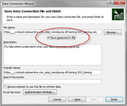

-
The pivot table field list will now be available for you to use.
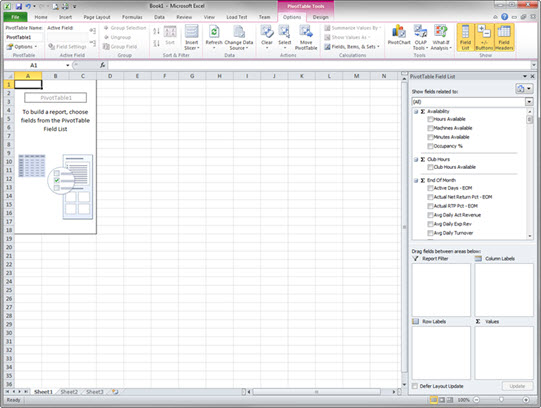
Congratulations! You have now successfully connected to your data cube, and you should see a range of pivot table options to the right of the spreadsheet.
Please contact Astute BI if you have any questions in how to make the most of the data cube.
Click to find the instructions you need for managing your connection to the Astute BI Data Cube:
- How to Connect Using an Existing Connection
- How to Change Connections in an Existing PivotTable
- How to Remove Connection from a Document
- How to Remove Data Cube Connections from a Computer
How to Connect to the Astute BI Data Cube Using an Existing Connection
Use the following steps to create a new PivotTable linked to the Astute
BI Data Cube by an existing connection. It’s not necessary to create a new connection
each time that you use the cube as this information is stored in the My Data
Sources folder of a computer.
- Go to Insert
- Select PivotTable
- Select Use an Existing Source
- Select Choose Connection
- Select the connection that you would like to use.
- Click on Open
- Click on OK
How to Change Astute BI Data Cube Connections in an Existing PivotTable
Use the following instructions to change an existing pivot table to a different
existing Data Cube connection.
- Click on the existing PivotTable
- Go to PivotTable Tools tab
- Select Analyze tab
- Select Change Data Source
- Click on Change Data Source
- Select Use an Existing Source
- Click on Choose Connection
- Select the connection that you would like to use.
- Click on Open
- Click on OK
How to Remove Astute BI Data Cube Connections from a Document
Use the following steps when you would like to sever the link between a document
& the Astute BI Data Cube (e.g. when sending a report to the client
who shouldn’t have access to the Cube). Please note that it’s not possible to
reconnect a PivotTable to the Data Cube if the connection is removed.
- Click on Data Tab
- Click on Connections
- Highlight connections to be removed
- Click Remove button
- Click on Ok
- Click on Close
How to Remove Astute BI Data Cube Connections from a Computer
Use the following steps to remove connections form a computer.
- Click on the Windows Start button
- Search for My Data Sources
- Delete cube connections as required
The Cube allows you to take your gaming and membership analysis to another level and gives you the flexibility to 'slice and dice' the data however you want. Once the Cube is setup, you can manipulate the data via a drag and drop system to drill into any area of your business that you want to view and produce the exact reports you want.
How to Run Reports
You can see below what the Cube looks like when you've logged in and before any
data has been specified.
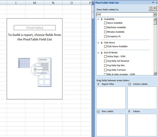
Creating reports is simple - the elements from the field list in the right hand column can be dragged and dropped into one of the bottom 4 boxes.
In the pivot table field list all Measures are at the top of the list, all Dimensions
are below. Dimensions can be Filters, Columns, or Rows while Measures are
always Values. You can tell which ones are Values because they have the
sum symbol ( )
before each header title as per the image above.
The other difference between Measures and Dimensions is that Dimensions have members and Measures are calculations.
To start, select one or more Dimensions and select one or more Measures. You can play around with where your Dimensions appear, whether they filter the report you're creating or whether they are set out on rows or columns.
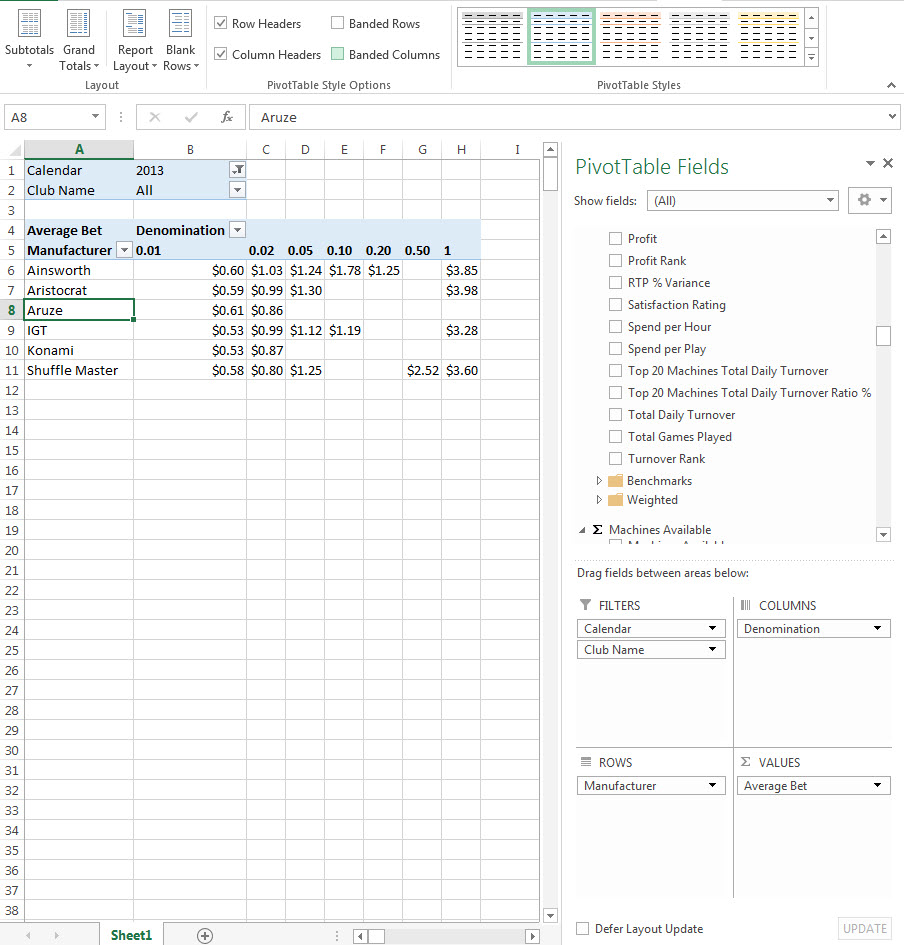
For example, if you wanted to show Average Bet by EGM denomination and serial number for a specific club, for October 2013 then your pivot table settings would look like the image below:
How to Save Reports
Saving reports to your computer is a great idea for reports that you will likely
want to view again and can be saved as you would save a normal file in Excel.
You have two options for updating your data. You can either open your file, click somewhere in the pivot table and then click 'refresh' under the 'Design' tab.

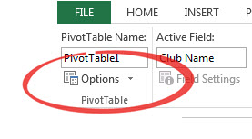
Alternatively you can make sure that every time you open a file that the data is automatically refreshed. To do this open your file, click somewhere in the pivot table and then click on 'options' in the top left:
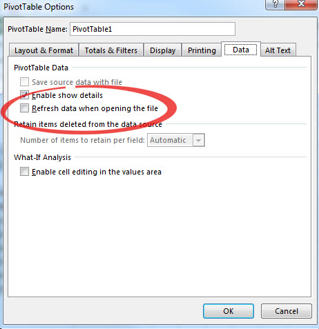
Once the options box opens, click on 'Data' and then tick the check box to 'Refresh data when opening the file' and click 'OK' to save this preference:
If you want to create a new report using your existing connection:
- Open a new document in Excel
- Click on 'Data' tab
- Then 'Existing Connections'
- Select your connection and click 'Open'
Filtering by dimension values
The below filter demonstrates how to filter the Astute BI Data Cube for
1c EGMs:
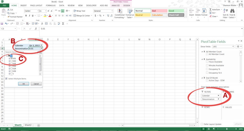
- Select the measure that you would like to filter by & drag it into the FILTERS, COLUMNS or ROWS box in the PivotTable menu
- Click on the filter icon
- Select what in the measure you would like included in your report.
Filtering by measures values
There’s a range of flexible Value Filters that can be applied to the Data cube
to highlight information such as Top & Bottom entries or entries Greater
than a selected threshold.
The below example shows how to select the Top 10 EGMs by Total Daily Turnover:
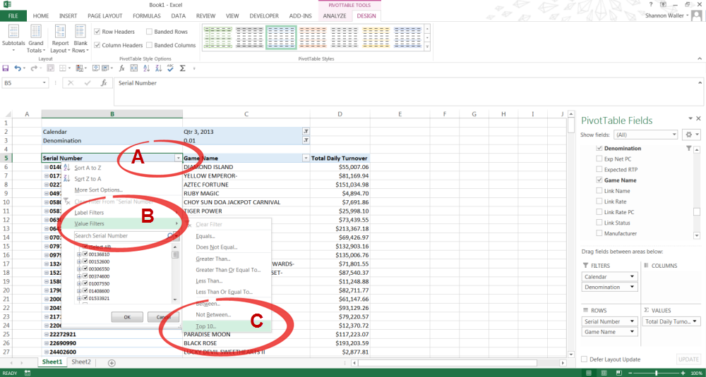
- Click the drop down arrow in the header row
- Select Value Filters
- Select Top 10
Sorting by Measure Values
The process of Sorting & Filtering by Measure Values is extremely similar.
The below example shows how an EGM list can be sorted by Total Daily Turnover:
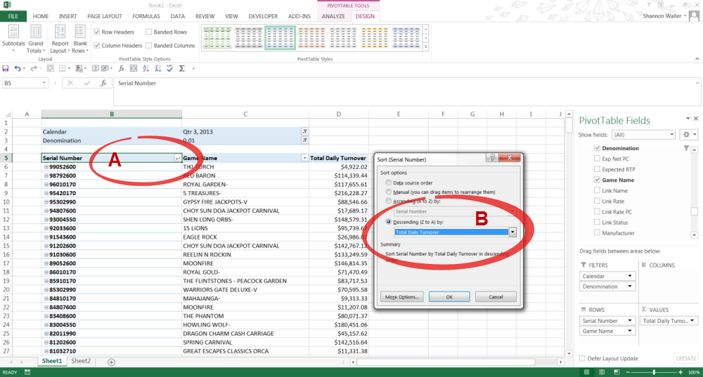
- Click the dropdown arrow in the header row
- Select More Sort Options
- Select the Measure that you would like to sort by.
Grouping
Grouping data in a PivotTable is a simple way to make sense of the data that
you’re analysing
The below example demonstrates how EGMs can be grouped to shows which gaming area they operate in:
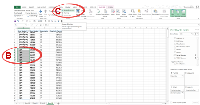
- Create a PivotTable with the data that you would like to review
- Select the data that you would like to group (e.g. Serial Number)
- Click on PIVOTTABLE TOOLS, ANALYZE & Group Selection
- You can now change the group name to something more meaningful. This is done by selecting the group name, clicking F2 & typing in the required group name.
- You can ungroup data by selecting the group, going to PIVOTTABLE TOOLS, ANALYZE&Ungroup
Graphs & Charts
You can link Graphs & Charts to a PivotTable & still make changes to
the data.
The below 2 examples show different ways to display the same data. Both show Total Daily Turnover for the period of July to September 2013 but in very different ways.
Example 1 shows the Total Daily Turnover Trend by Denomination for the 3rd quarter of 2013. The steps to create this were:
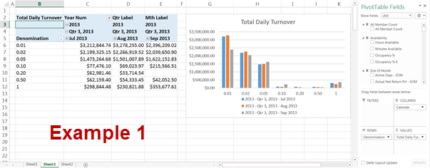
- Create a Astute BI Data Cube PivotTable with the required Dimensions & Measures.
- Click on INSERT & select Chart
- Click on the chart, PIVOTCHART TOOLS, DESIGN & Select Data. Select the area within the PivotTable that you would like displayed in the Chart.
- Add Chart Elements as required
Example 2 demonstrates which Denominations contributed the most Total Daily Turnover for the 3rd Quarter of 2013 (eg $1.00 EGMs contributed 4.11% of the Total Daily Turnover for the period):
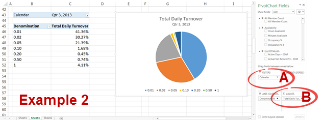
- Take the PivotTable from the previous Example 1 & move the Calendar Dimension from COLUMNS into FILTERS to group the 3 months together
- Go to the VALUES section in the PivotTable menu & click the arrow on the Total Daily Turnover Measure. Select Value Field Settings, Show Values As & Select % of Grand Total.
- Add Chart Elements as required
Conditional Formatting
Conditional Formatting can be applied to a PivotTable to enhance its visual impact.
The below PivotTable has had Conditional Formatting applied to it by:
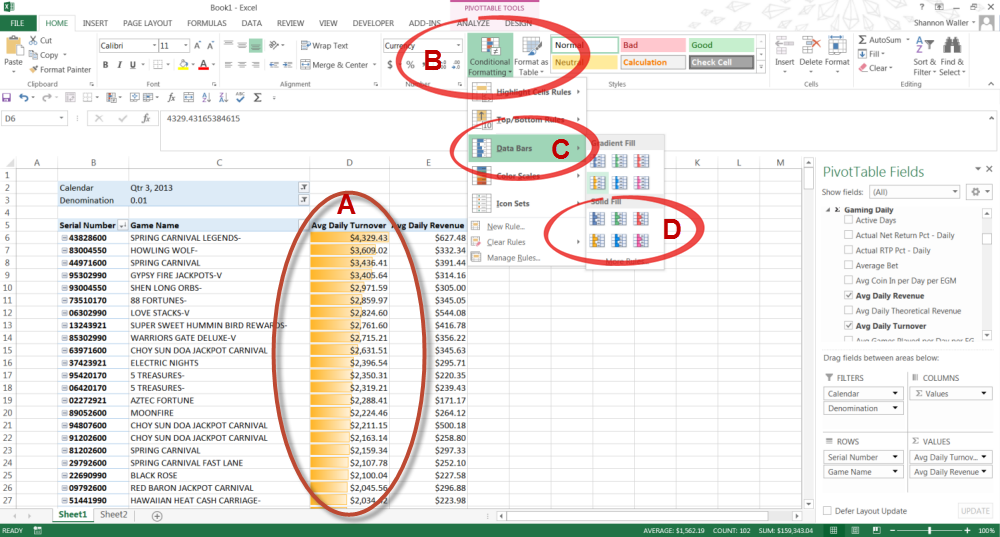
- Selecting the cells which are to receive Conditional Formatting
- Select Conditional Formatting from the Home Manu
- Select Data Bars
- Select the fill that you would like
How to Sort by Different Headers
If you want to sort the data by different column headings then you will need
to copy all the data in your sheet and paste it into a new Excel document or
spreadsheet. By copying and pasting the data into another sheet or document,
you will lose the pivot table settings and the connection to your data for that
particular report so it's best to do this when you've settled on the contents
for the report and it's time to manipulate and present it how you want.
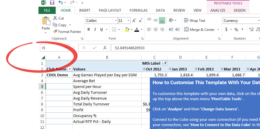
An easy way to copy all data in a sheet is by clicking on the triangle at the apex between the columns and rows as per the screenshot below.
Benchmarking
Astute BI benchmarking data allows you to compare your venue's performance against the rest of the industry. Benchmarking reports allow you to filter by venue type and region to get a specific comparison of your venue's performance against venues from a similar region.
On Astute BI benchmarking reports your venue's performance is shown in blue on the graphs. The filtered benchmarking data is provided in four classes as defined below. Venues are ranked within the benchmarking sample based on the average daily profit and allocated to the Top, Mid and Low groupings.
Low 25%: The average of the bottom 25% of venues for a selected region and period
Mid 50%: The average of the middle venues (not in top 25% or low 25%) for a selected region and period
Top 25%: The average of the top 25% of venues for the selected region and period
Average: The average of the venues for a selected region and period.
Gaming
When analysing data, it is critical that you first decide what question you are trying to answer and, just as importantly, who needs the information. For example, the answer to “How is my gaming floor performing?” will change quite a bit depending on who is asking.
Within the one venue, there are several different perspectives on that one question about gaming floor performance:
- Financial perspective: How much money is the gaming floor making, and what are the costs associated with running the gaming floor?
- Gaming perspective: How are individual games performing? Which games are most popular?
- Marketing perspective: What impact does specific marketing programs or incentives have on gaming profitability?
You can find answers to those questions in the different Astute BI modules.
In the Astute BI Financial Module, you will find a big picture view of Gaming in the Gaming Scorecard report.
Financial -> Gaming Scorecard

There are also trend reports in the Financial module which provide context by comparing your venue to other venues. You can filter this report by State, location, region, type, club type and EGM size to really make sure that you're getting the most applicable comparisons.
In the Astute BI Gaming Module, you can drill in and get a daily summary of how your gaming floor is performing in terms of profit and turnover, including best and lowest performing games.
Gaming -> Venue Summary
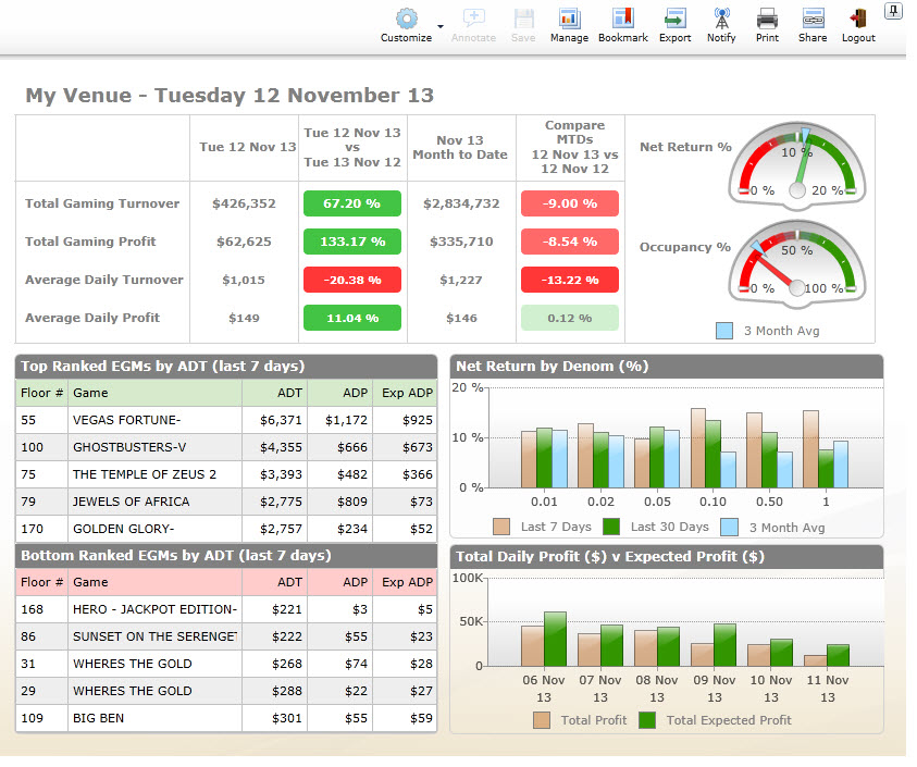
There is also monthly reports available which include venue specific information and benchmarking comparisons.
In the Astute BI Membership Module, you can find detailed information on your members and what effect your promotional activities are having on your member's spending patterns.
Membership -> Membership Summary
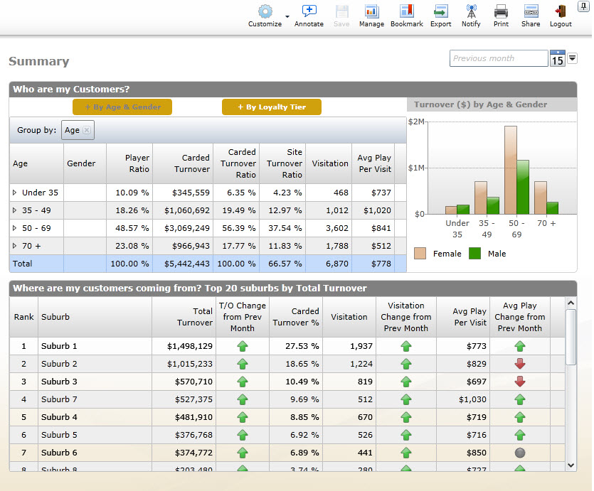
You can use this information to target particular suburbs through your marketing activities and adjust your marketing message to appeal to your most profitable age group and gender and then in subsequent months see what is working and what isn't.
One of the best report to use when analysing your overall EGM performance - both in terms of highlighting your 'winners' and your problem machines - is to look at the EGM Occupancy Dashboard.
This Dashboard provides an easy-to-use snapshot of how each machine on your floor is performing relative to its usage and turnover. It's then easy to drill into each game and find out more about the KPIs for a particular machine.
The Dashboard is based on the Occupancy for each EGM. Occupancy is calculated by dividing the venue's operating hours by the number of strokes played on an EGM, multiplied by 7 seconds.
Gaming -> EGM Occupancy

a. Filter Menu
b. Scatter Graph
c. Denomination or Manufacturer view
The graph above shows % Occupancy of each machine compared to its ADT or in other words how much the machine is used compared to the amount of money that goes through the machine. Each dot on the scatter plot represents a machine on your floor.
The scatter chart can by shown by denomination or manufacturer by clicking the radio bottom below the chart (in the section marked 'C'). Each manufacturer or denomination is colour coded to provide a quick visual overview.
Filters can also be applied to focus on a particular manufacturer or denomination. For example, you could filter the chart to show only 0.01 cent machines.
Why is Occupancy Important?
Occupancy is a function of how customers behave with your gaming products.
This scatter plot enables you to assess how your products attract different playing
behaviours.
Here are a couple of examples. A low % Occupancy but a high ADT will show higher betting behaviour. On the other hand, a high Occupancy and high ADT is likely to show either high betting behaviour amongst few or several players, or comparatively lower betting behaviour over a larger quantity of players. With high % Occupancy and high ADT, there is likely to be in-house competition for this machine and there exists opportunity to expand this product on the floor.
Machines in the far left bottom corner that show the lowest % Occupancy and lowest ADT show cause for review.
What KPIs are available for each EGM?
Click on a blue dot and a pop up window will appear with full details for that
particular EGM.
The data available in each pop up window for each EGM includes
- floor number
- serial number
- manufacturer
- expected net percentage
- actual net percentage
- turnover
- profit
- average bet
- strokes
- ADT
- expected ADP
- actual ADP
- graphs showing ADT ($) and ADP ($) in terms of the venue and state averages and for the particular EGM
Astute BI Report Builder function allows you to compare the performance of a particular EGM with other similar sized venues in a particular region.
To access Report Builder, click on the Benchmarking Module, Gaming Section then Report Builder at the bottom of the sidebar.
Benchmarking -> Gaming -> Report Builder
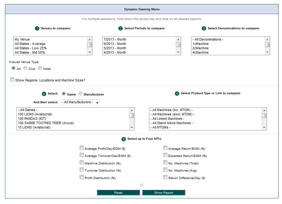
If, for example, you wanted to show the performance of EGMs in NSW venues with less than 50 EGMs you would:
- Click on ‘Show Regions, Locations, Machine Size’
- Click on the filter you want e.g. ‘0-50 machine NSW clubs’
- Select the time period you'd like to view
- Select the denomination - for games split by denomination select each individual denomination and to combine 1,2 and 5c games into a single view select ‘All Denominations’
- Select required manufacturer or game - selecting ‘All Games’ will give you a denomination or floor average. If you want to select every game, click on the first game and then hold down the ‘Shift’ key on your keyboard and press ‘End’.
- Select product type or link to compare
- Select up to 4 KPIs you'd like to see
- Click on 'Show report'
The report can then either be viewed online or downloaded to your computer for further customisation.
When purchasing a new EGM for your venue, Astute BI reporting can provide a range of independent data that can assist you to make the best possible decision for your venue. A strategy to determine which new games to buy and which games to remove could include:
In the first instance, it is a good idea to get an idea of how your gaming floor compares in terms of denomination and manufacturers to the Top 25% of venues in your state. To do this go to:
Gaming -> Distribution-> Denomination
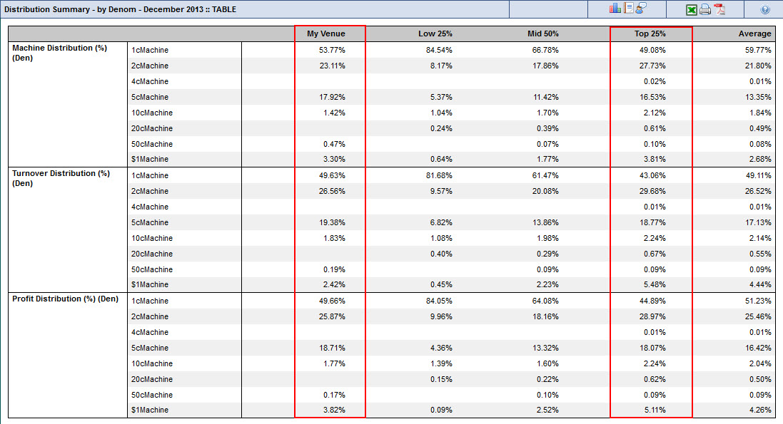
From the above data you can see that this demo venue has a higher number of 1c and 5c machines than the top 25%, and a lower amount of 2c, 10c and $1 machines. Interestingly the top 25% have a higher profit percentage from $1 machines compared to the rate of distribution (3.81% distribution and 5.11% profit - in other words they are disproportionately profitable compared to the number of machines) so this maybe something worth investigating.
Gaming -> Distribution-> Manufacturer
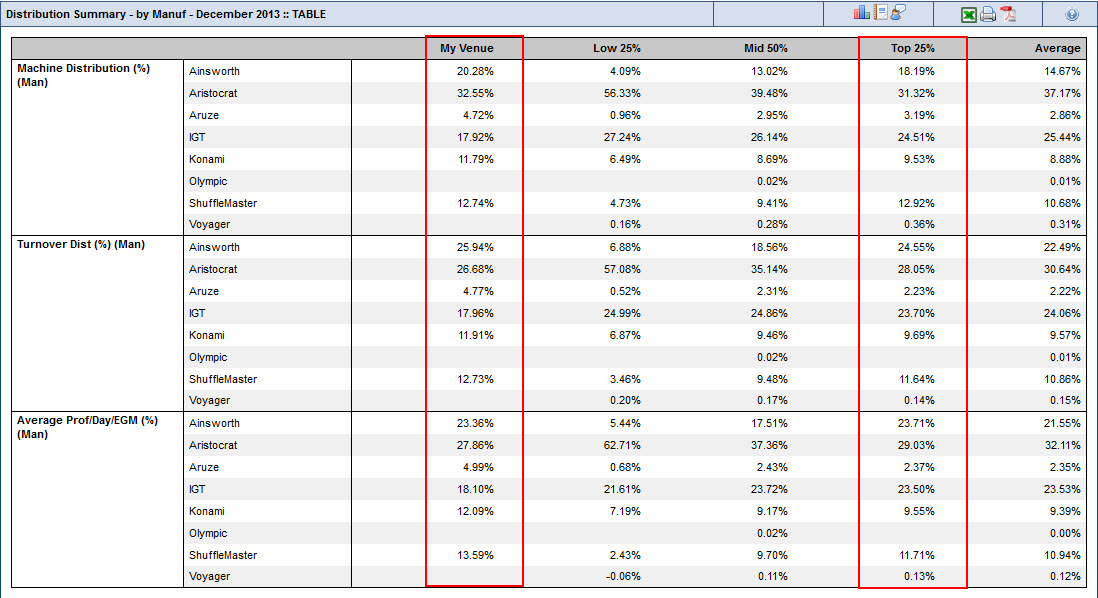
From a manufacturers perspective, the demo venue has a higher proportion of Ainsworth, Aristocrat, Aruze and Konami and a lower proportion of IGT than the average for the top 25%. The average profit/day/EGM is lower for Aristocrat both in terms of the venue's distribution (32.55% distribution compared to 27.86% profit) and lower than the average for the top 25%.
From the above analysis, it is worth considering a change to the mix of denominations and manufacturers to raise the profitability of this venue.
Once this initial analysis has been done then it's worth looking at EGM Occupancy data and drilling into a particular denomination and manufacturer to highlight particular machines to replace. For more information, please see Analysing EGM Performance.
An examination of the performance of your gaming floor can also be done via the Cube.
It would also be worth looking at the games that your top members most like to play, what the turnover and profit is for those top members and see whether any of those EGMs are in your target list for replacement.
To determine possible games to select you could look at the machines that the top 25% of venues currently run. This can be done through Dynamic Reports in the Gaming Module (bottom of the Gaming sidebar).
Gaming -> Customise -> Dynamic Reports
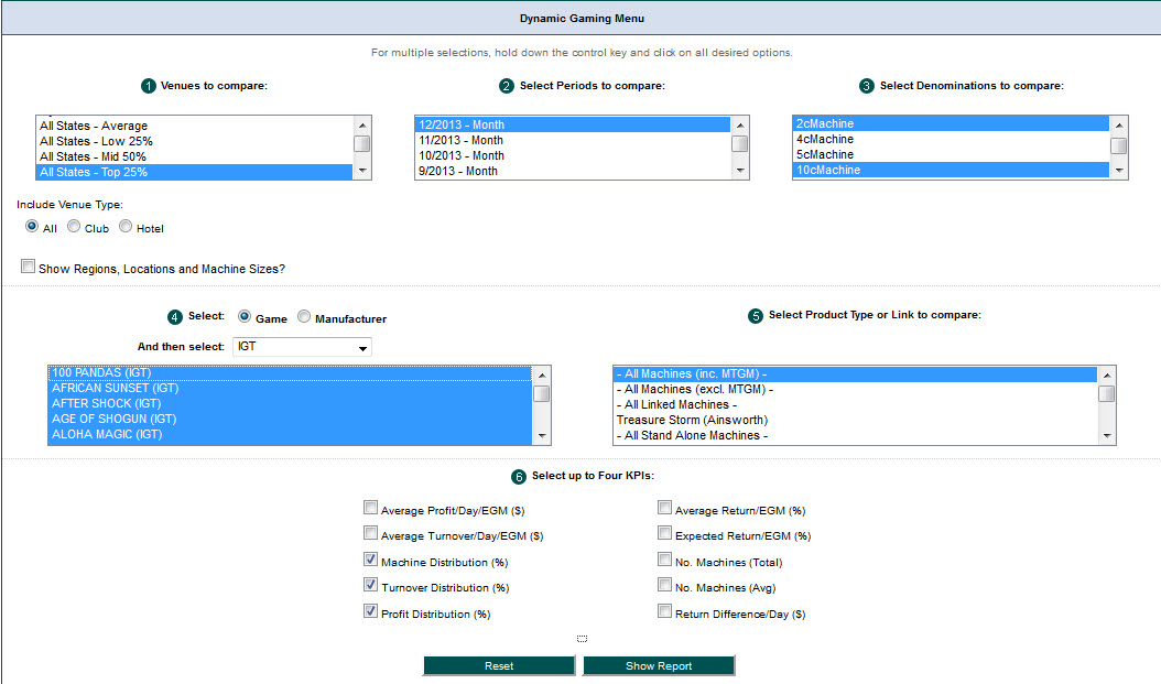
As we identified earlier that the venue was low in 2c, 5c and $1 machines compared to the top 25% of venues and had a lower mix of IGT machines, the following options were selected on the dynamic gaming menu:
- All States Top 25% (you can choose this option or your particular state)
- Most recent month
- 2c, 10c and $1 denominations
- Manufacturer: IGT
- All games
- All machines
- Machine Distribution (%)
- Turnover Distribution (%)
- Profit Distribution (%)
Based on those variables the following report was produced:

The top 4 machines highlighted maybe worth considering as they all have a higher profit distribution compared to the machine distribution percentage.
The other way to analyze the data would be to look at all manufacturers and denominations for the top 25% and see if you already have any of the machines listed. If you do then these machines could be the ones that you encourage your top members to use or think about re-positioning on your floor to raise your level of occupancy and profitability.
Membership
The Astute BI Membership module provides a detailed view of where your members live, their gender and age range. This information can then be used in your marketing efforts to target particular demographics and with the report timing options available you'll then be able to see clearly what promotional activities had the desired results and what didn't.
The Astute BI Membership module allows you to segment your members into particular categories that you can then drill into and analyze to identify the strengths and opportunities.
For example, if your daytime customers are usually women aged 50-70 years from 5 suburbs all within 5 kilometers of your venue then you may consider sending an offer for a lunch voucher to your male members in that age bracket and living in those suburbs to encourage more men to attend during the day. Or you could target female members 50-70 years in other nearby suburbs, either through particular events likely to appeal to them or specific dining or gaming offers.
Or perhaps the members in a particular suburb used to be your top performers but have dropped away recently. You could send an offer to all your members in that suburb to encourage them to visit your venue or you could make a special offer to the top 10 performers in that suburb, perhaps highlighting the new games you have on the gaming floor that are likely to appeal to them.
The dashboard that provides an overview of your members is the Demographics Dashboard.
Membership & Marketing -> Demographics
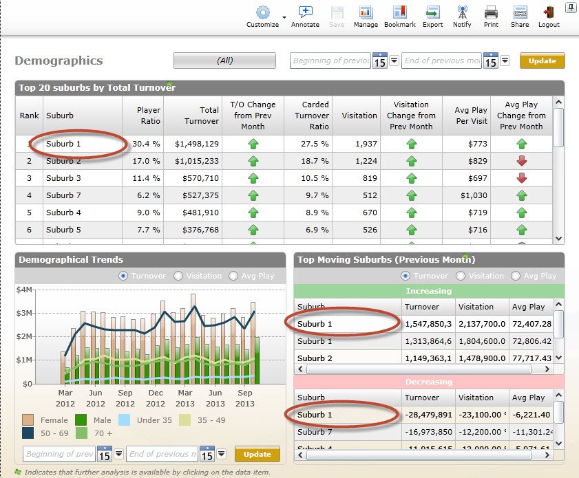
By clicking on any suburb as highlighted above, a pop up will appear like the one below providing more detailed information for that particular suburb.
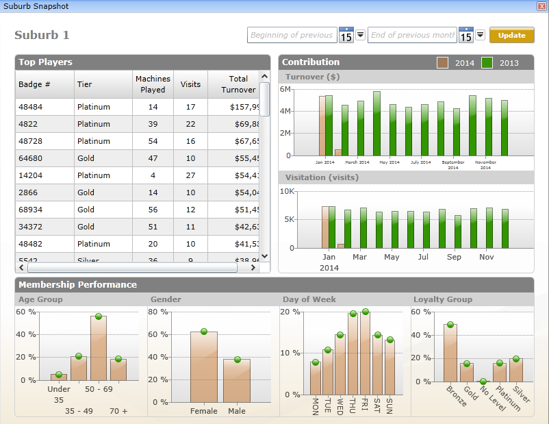
The above dashboards give a great overview of the demographics for your venue and highlight details that are worth drilling into. However, the best way to dig further into the demographics for your venue is by using the functionality of the cube.
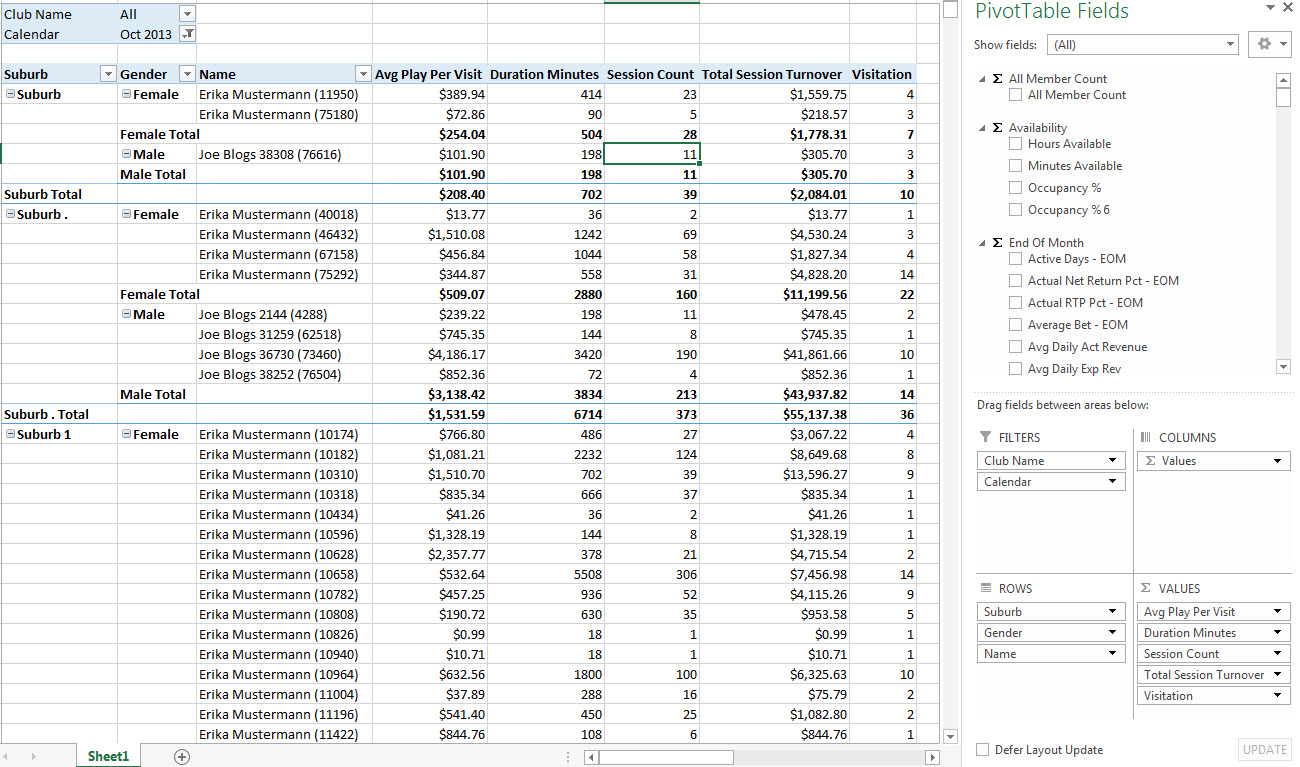
For example, the screenshot below shows the names of the bottom 10 members for a venue by gender and age and looks at a number of KPIs (average play per visit, duration, session count, total session turnover and number of visits to the venue for the selected month).
Data
Data can be analysed more productively if it is presented in an effective manner. Excel provides many tools that allow for data to be displayed in easy to comprehend formats.
- Trendlines
- Types of Trendlines
- Sparklines
- Types of Sparklines
- Scenarios
- The What-If Analysis Option
- The Scenario Manager Dialog Box
Trendlines:
Definition: A trendline is a graphical representation of trends in a data series.
Usually represented as a line, a trendline can be particularly useful in depicting
current or future trends.
Trendlines can be added to the data series in a column, line, bar, area, stock, or bubble chart. They can be created using default settings or you can create your own custom settings.
Types of Trendlines
There are a number of different types of trendlines that you can use depending
on what you are trying to show.
Exponential
Curved lines that are best used when data values rise or fall at increasingly
higher rates.
Linear
Straight lines that are best used with linear data sets.
Logarithmic
Curved lines that are best used when the rate of change in the data increases
or decreases quickly and finally levels out.
Polynomial
Curved lines that are best used when the data fluctuates with ups and downs.
Power
Curved lines that are best used with data sets, which compare measurements that
increase at a specified rate.
Moving Average
Curved lines that are used to smooth out any fluctuations in data, thereby displaying
a pattern in the data.
Sparklines
Provide the simplest way to represent trends in a cell on a worksheet.
Definition: A sparkline is a tiny chart embedded in a cell to
represent the trend for a given range, which can be a row or column. Unlike a
chart, a sparkline can be used as a cell background.
Moreover, you can create a sparkline for a single range and then extend it to multiple ranges using the fill handle.
Types of Sparklines
There are a number of different types of sparklines that you can use depending
on what you are trying to show.
Line
Data trends are displayed in the form of a straight or zigzag line.
Column
Data trends are displayed in the form of column. Each data value is represented
by a column whose size is proportional to the data value.
Win/Loss
Data trends are displayed through the high points, the median, and the low points.
Scenarios
Allows you to create and test multiple scenarios to help you choose a particular
outcome and plan accordingly.
Definition: A scenario is a set of input values substituted
for the primary data in a worksheet. These input values are used to forecast
outcomes based on the data that represents the scenario in your worksheet. You
can create any number of scenarios in a worksheet and switch between them to
view their results.
The What-If Analysis Option
The What-If Analysis option is used for performing analysis using the Scenario
Manager, Goal Seek, and Data Table options.
Scenario Manager
Create scenarios.
Goal Seek
Set the value stored in a single cell to a specific value, thereby changing the
value stored in another cell.
Data Table
Display the varying results of formulas based on different values given as input.
The Scenario Manager Dialog Box
The options in the Scenario Manager dialog box allow you to create, edit, delete,
and merge scenarios.
Scenarios
Lists all scenarios you have created in the worksheet.
Add
Invokes the Add Scenario dialog box that allows you to create a new scenario.
Delete
Deletes the selected scenario.
Edit
Invokes the Edit Scenario dialog box that allows you to edit a scenario.
Merge
Allows you to merge scenarios from other worksheets.
Summary
Displays a summary of the scenario in the Scenario Summary dialog box.
Changing Cells
Display the cell reference for changing cells.
Comment
Displays the comments entered in the Add Scenario dialog box.
Show
Displays the result of the selected scenario on a worksheet
While managing workbooks in Excel, you may have found some common tasks that are repetitive. You can simplify the methods of performing these tasks in Excel.
As an experienced Excel user, there may be times when you need to automate frequently performed tasks, restrict the type of data entered in cells, or format data based on predefined criteria. Streamlining your workflow by tailoring the Excel environment to your job needs can increase your productivity and improve your efficiency.
- Conditional Formatting
- Conditional Formats
- Macros
- The Record Macro Dialog
- Macro Naming Rules
- Macro Referencing
Formatting
This allows you to quickly identify specific information that meets a given criteria
to make it easier to identify and differentiate between the data within it.
Definition: Conditional formatting is a formatting technique that applies a specified
format to a cell or range of cells based upon a set of predefined criteria. In
Excel, the cells to be formatted can contain numeric or textual data. The condition
for formatting can be set using default or user-defined rules.
Conditional Formats
Excel provides different types of conditional formats that can be applied using
the Conditional Formatting option in the Styles group on the Home tab.
Highlight Cell Rules
Quickly find specific cells within a range of cells. You can format those cells
based on a comparison operator. This format is applied by selecting the desired
option displayed in the Highlight Cell Rules submenu.
Top/Bottom Rules
Find the highest and lowest value in a range of cells based on a cut-off value
you specify. This format is applied by selecting the desired option in the Top/Bottom
Rules submenu.
Data Bars
View the value of a cell relative to other cells. The length of the data bar
represents the value in the cell. This format is applied by selecting a data
bar format from the Data Bars gallery. A data bar can be customised if required.
Colour Scales
Visually represent data distribution and variation. The shade of the colour in
this format represents higher, middle, or lower values. This format is applied
by selecting a colour scale format from the Colour Scales gallery. A colour scale
can be customised if required.
Icon Sets
Annotate and classify data into three or five categories. Each category is represented
by an icon. This format is applied by selecting an icon set type from the Icon
Sets gallery. An icon set can be customised if required.
Macros
Macros automate complex tasks and ensure their precise replication.
Definition: A macro is a task automation tool that executes
a set of commands to automate a series of frequently used steps. Each macro is
uniquely identified by a name. A macro-enabled Excel workbook has .xlsm as the
file extension.
You can use the macro recorder to record a sequence of actions, and then perform the tasks by using the macro name or a simple command assigned to the macro. The set of commands in the recorded macro is converted into a Visual Basic programming code that can be edited if required. Macros can be stored in the Personal Macro Workbook, a new workbook, or in the current workbook. Macros that are stored in the Personal Macro Workbook can be used in any workbook.
The Record Macro Dialog Box
The Record Macro dialog box is used to specify details about a macro and to start
recording the macro. You can specify details such as the macro name, shortcut
key for running the macro, location in which the macro will be stored, and description
of the macro in the Record Macro dialog box. The Record Macro dialog box can
be displayed from the Macros drop-down list of the View tab.
Macro Naming Rules
There are certain rules to follow when you create macro names:
- The name must begin with a letter.
- The name must not contain spaces.
- The name can contain letters, numbers, and the underscore character.
- The name should not be in conflict with the name of another object in the worksheet or workbook, or any built-in name.
Macro Referencing
There are two types of referencing used in macros: absolute and relative. In
absolute referencing, actions are recorded by taking the absolute position of
cells. There, the macro will perform the actions in the same cell positions,
irrespective of the position of the cell pointer.
In relative referencing, actions are recorded relative to cell positions. For instance, if you record a macro that moves the cursor to cell A5, with cell A 1 selected, then if you enter some text, absolute reference will insert the text in cell A5, irrespective of the selected cell. Relative referencing, on the other hand, would place the text in the fourth cell to the right in the same row. By default, macros are recorded using absolute referencing. To use relative referencing, you need to choose the option Use Relative References from the Macros drop-down list before recording a macro.